John
            wall
identity
    Design
       2015
    branding &
product
   marketing
(Project 08)
WELCOME
WELCOME
OVERVIEW
When NBA star point-guard John Wall switched from Reebok to Adidas he needed a new logo to usher in a new era.
Research - 01
Unlocking John's Voice
Before we could develop any new mark we needed to tap into who he was—both on and off the court.
We showed him graphics, product ideas, along with words and phrases to get him talking about himself.
From here, we isolated three key touch-points that the identity would need to be emblematic of.
Define - 02
1

Personality

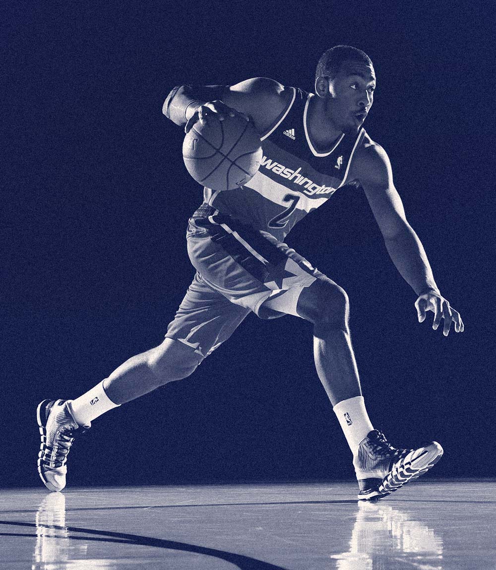
John has an insatiable desire to improve. He's never satisfied-so determined.

2

Style

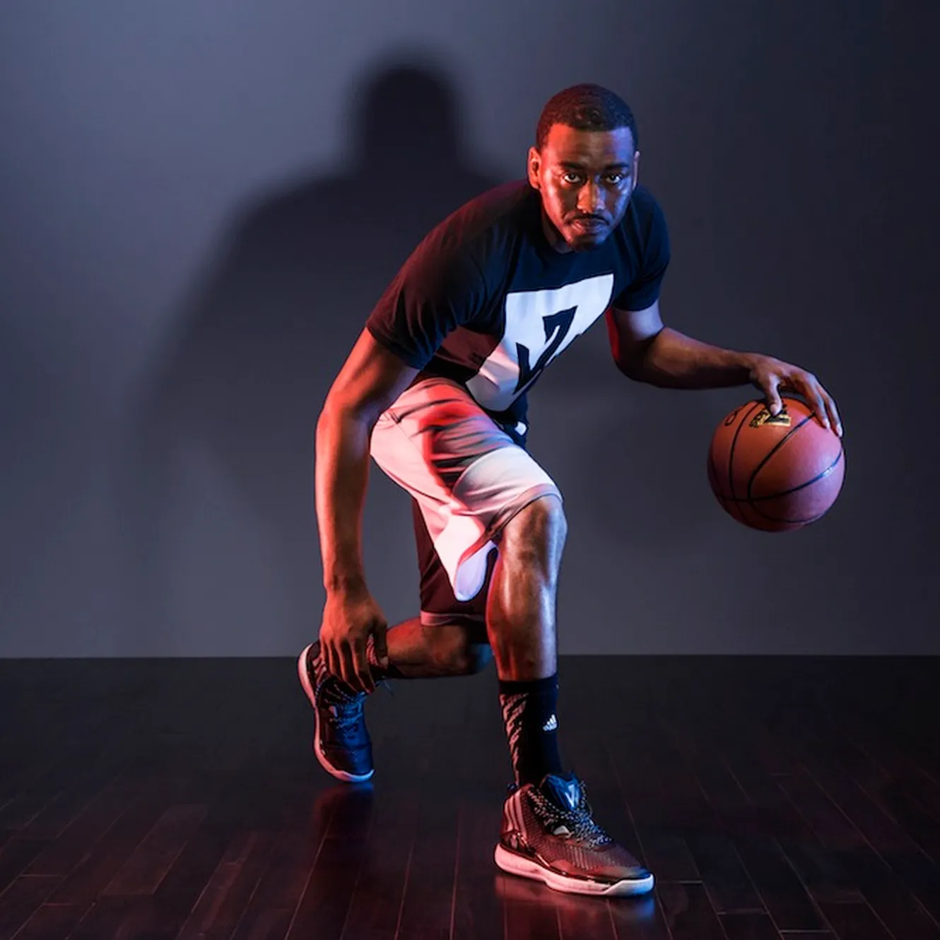
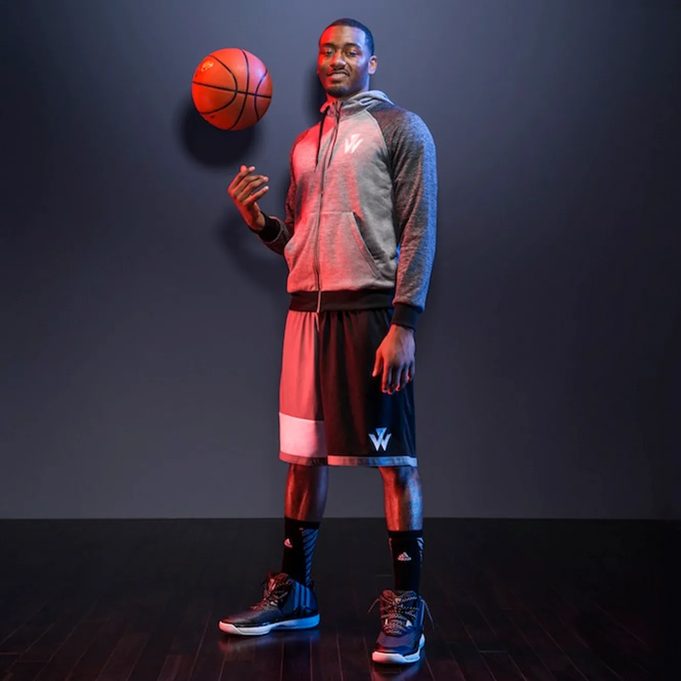
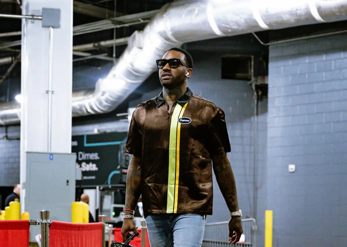
John consider's himself not only a dynamic player but also a trend-savvy, stylish person.

3

Speed

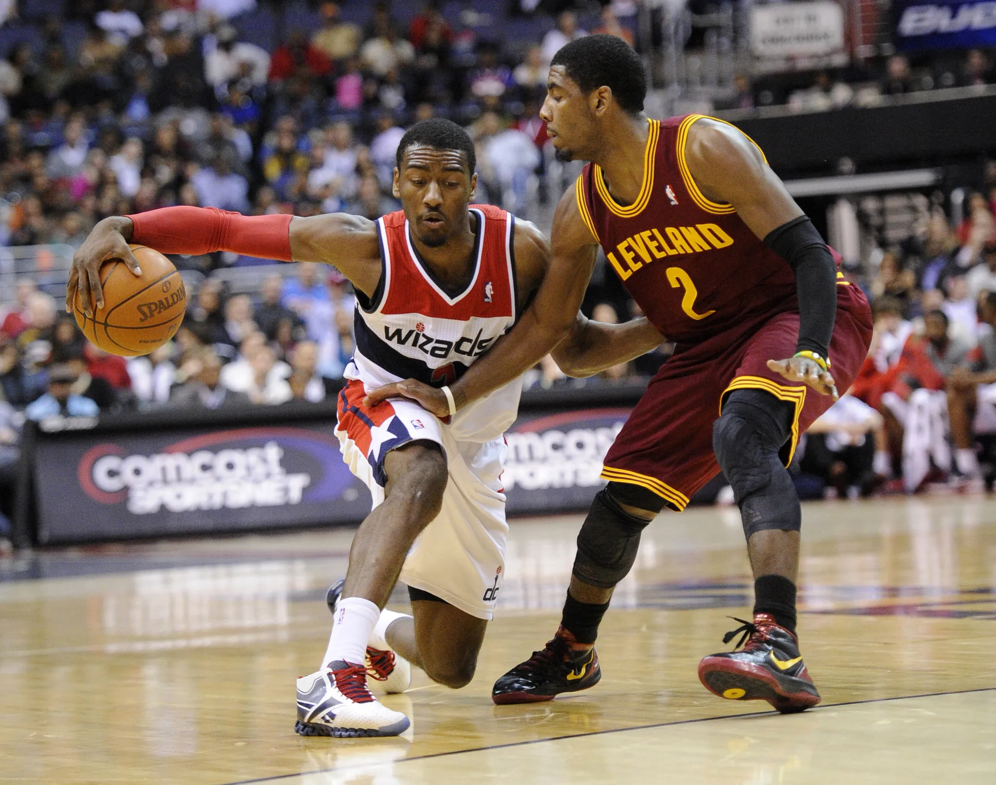
John's blazing speed and signature cross-over are defining aspects of his playing style.

Design, iterate, refine

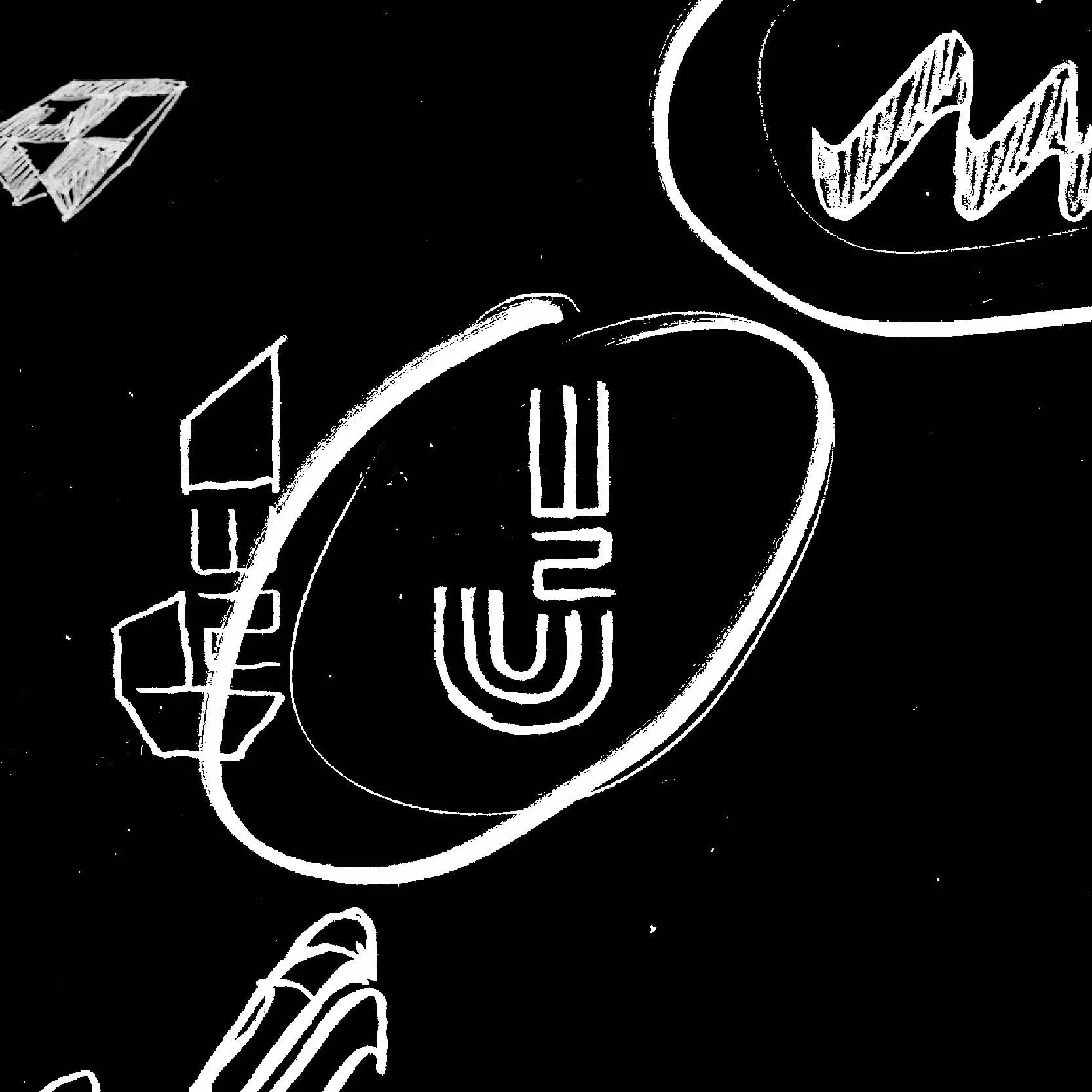
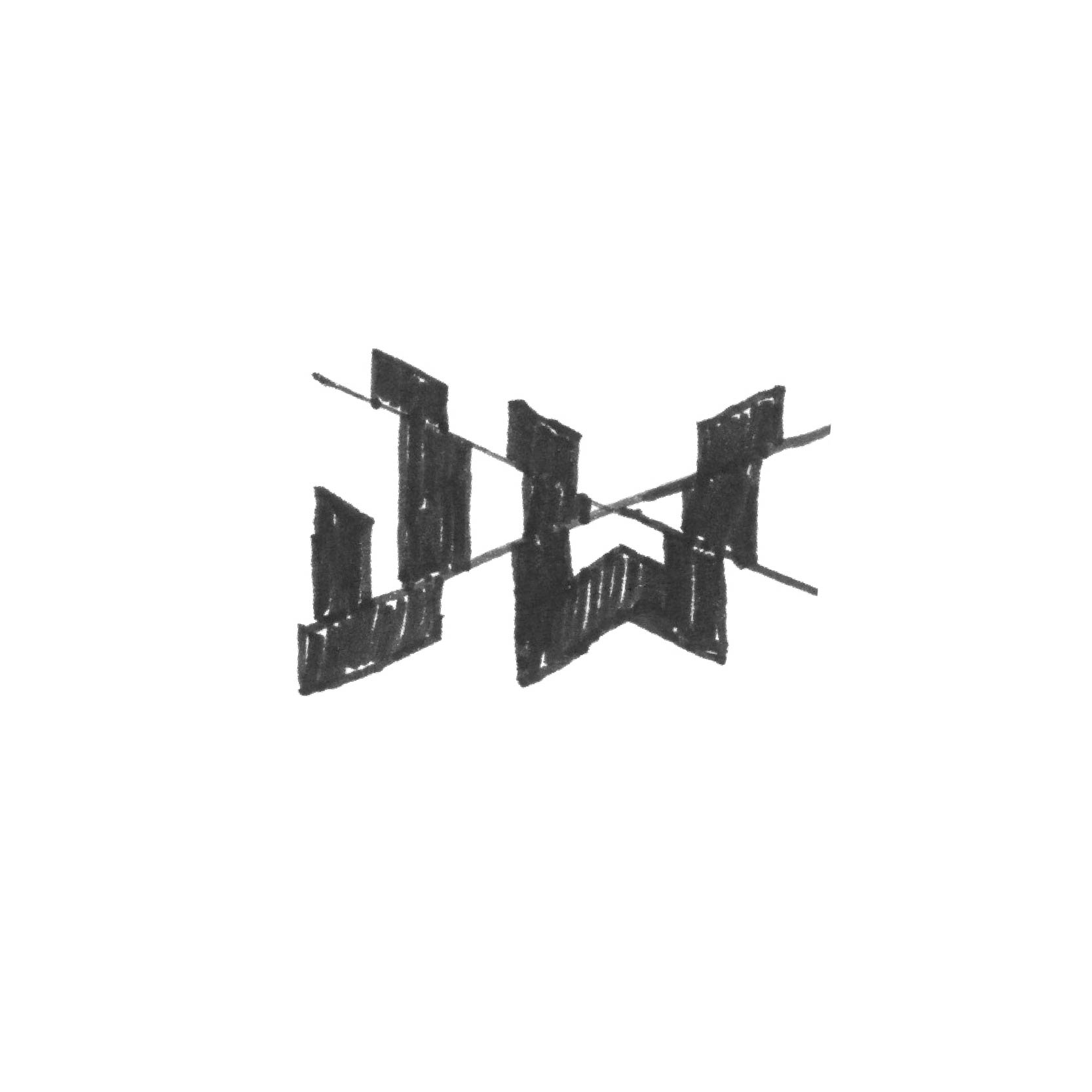
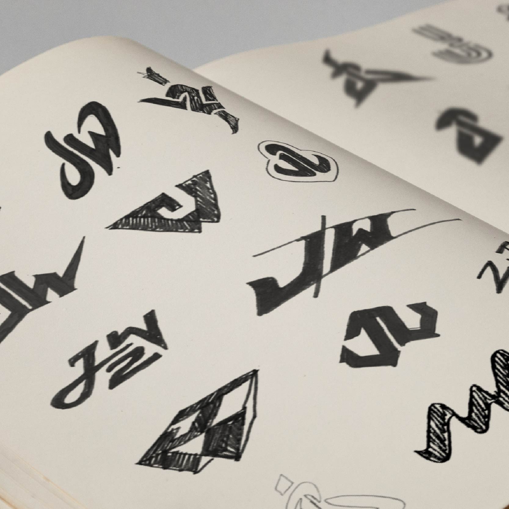
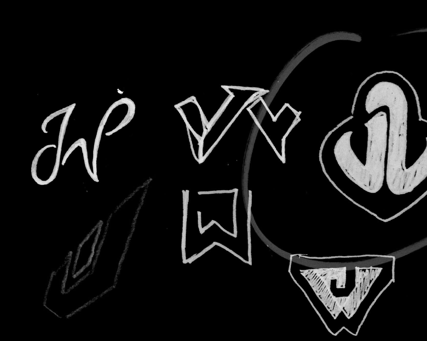
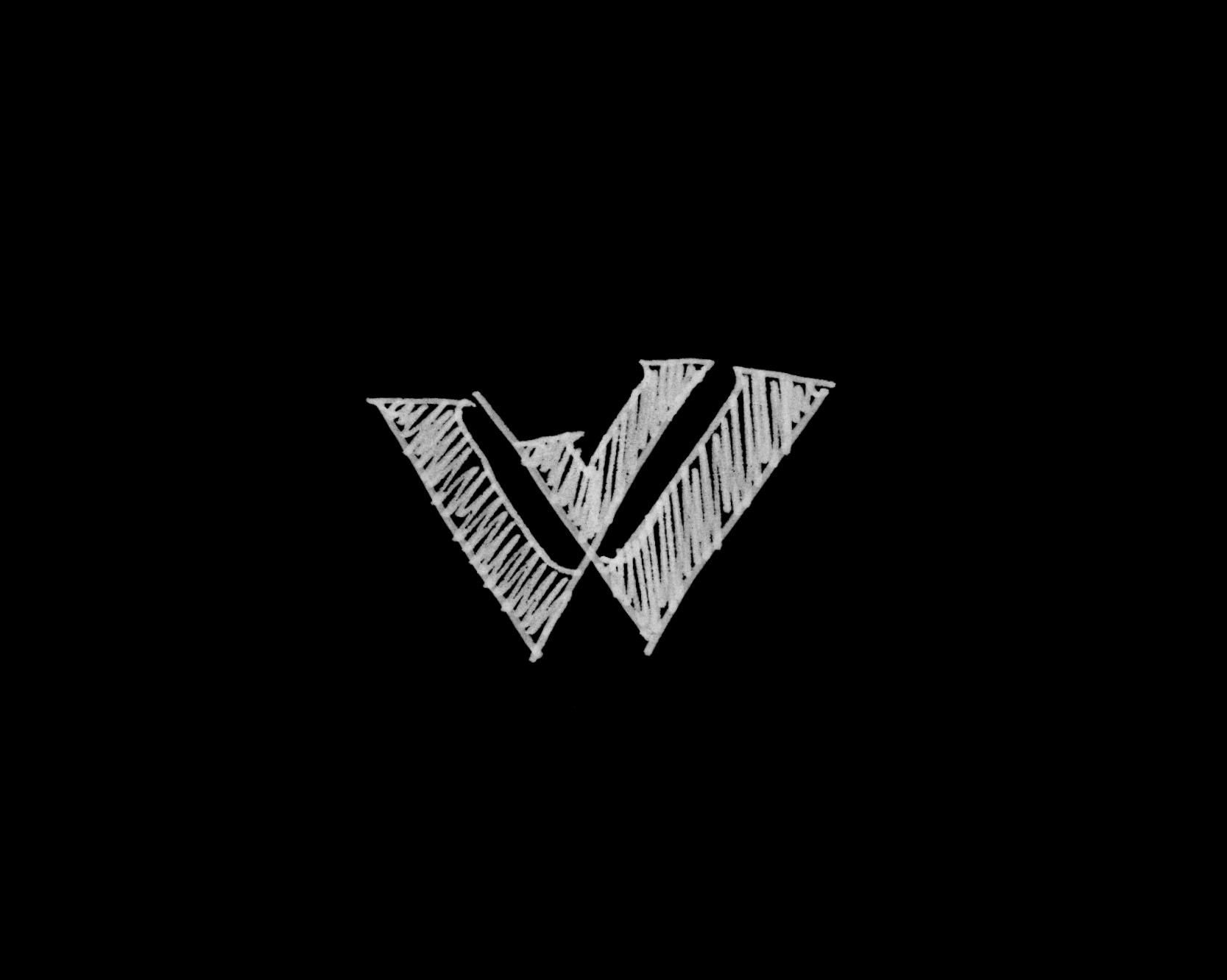
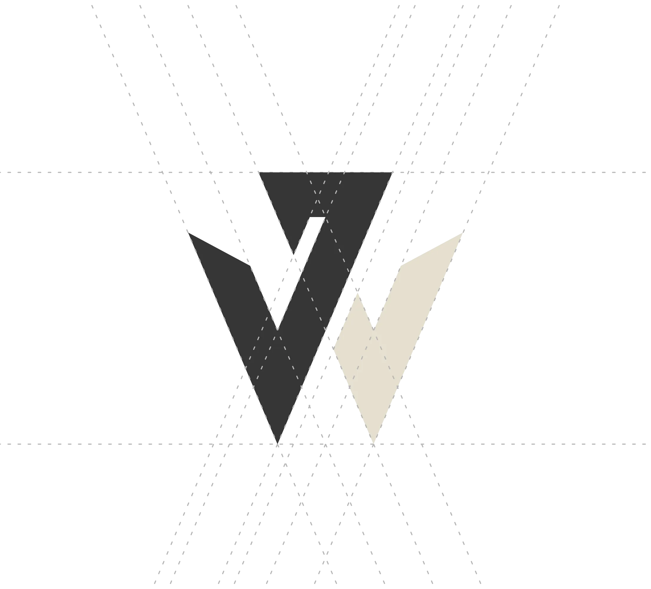
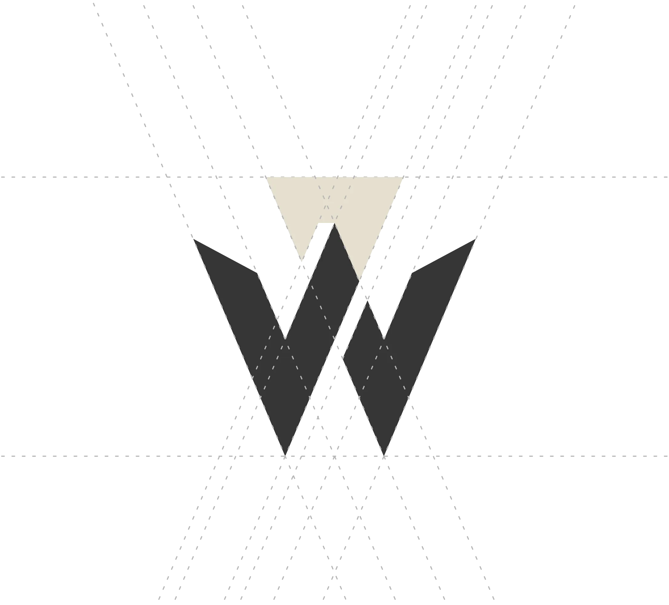
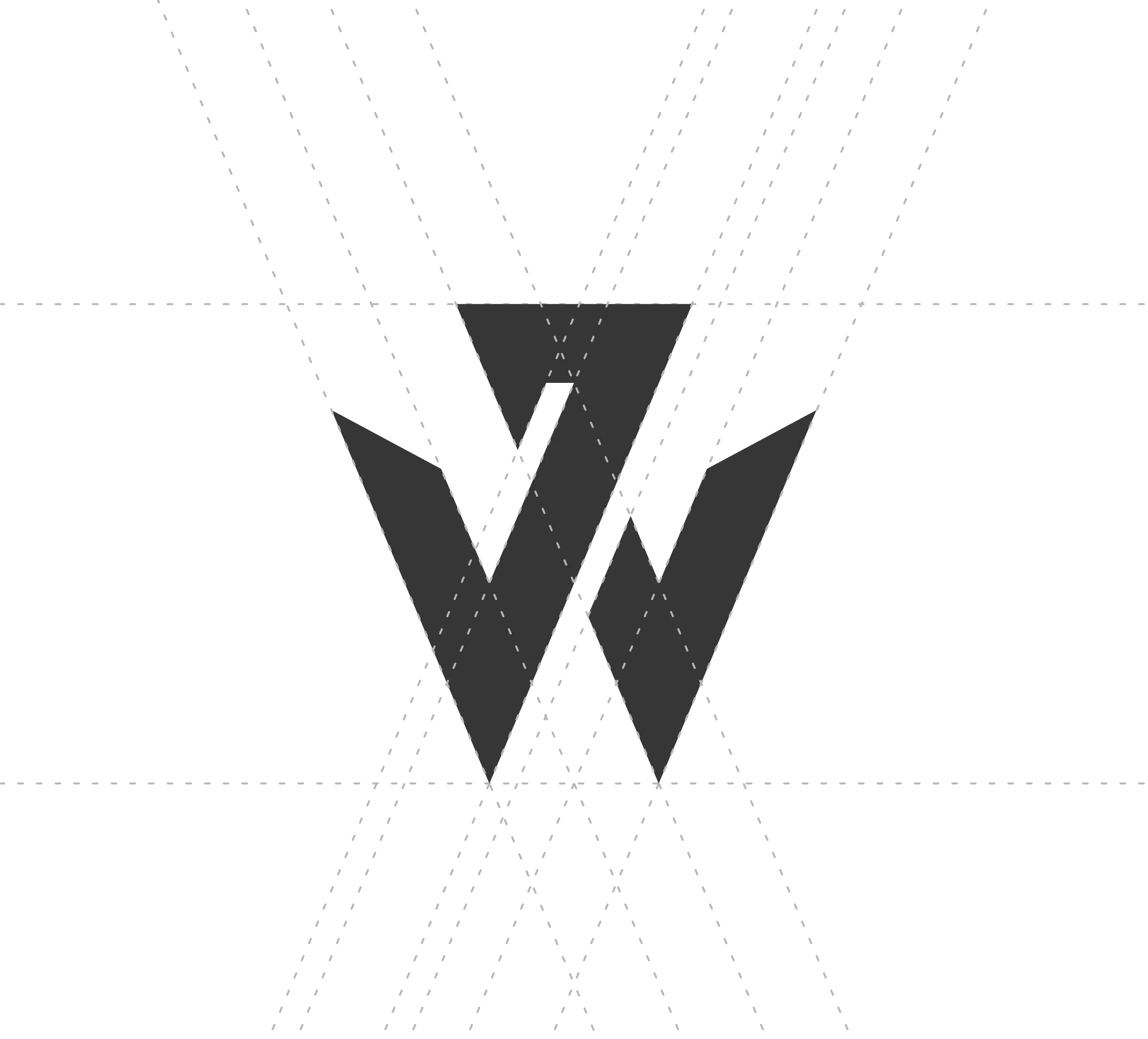
Once our field of play was set, we delved into various visual options, ultimately honing in on styles that matched John's aesthetic. Here's some of the exploration:

The final result

Making the cut

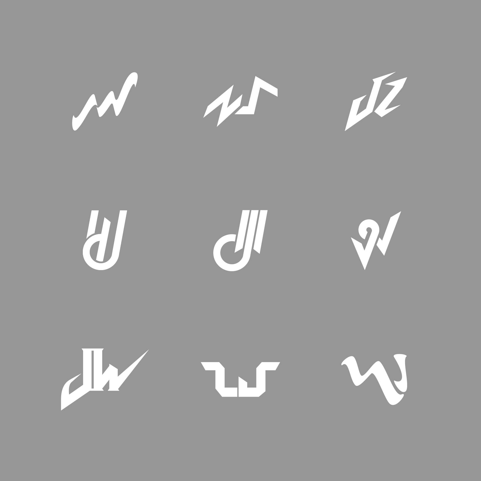
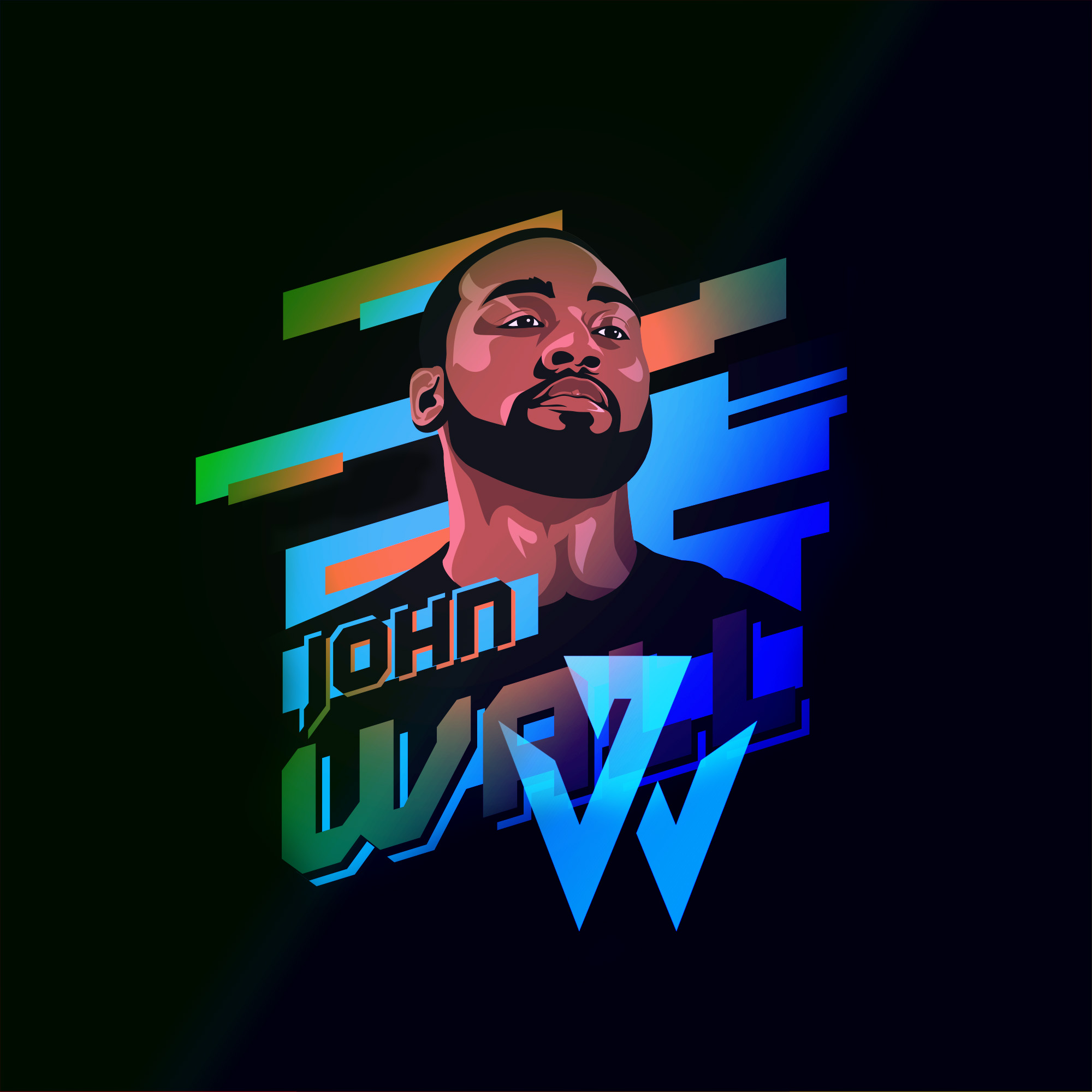
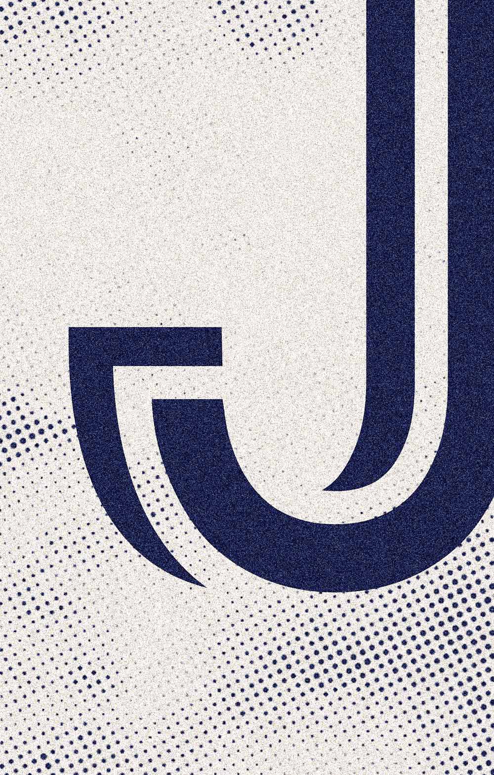
The final logo best mirrored the duality of John, both as a stylish person and an agile player.

Visual Breakdown

01
The timeless visual impression of the mark represents John’s style.

02
The logo’s lines quickly change direction like John and his crossover.

03
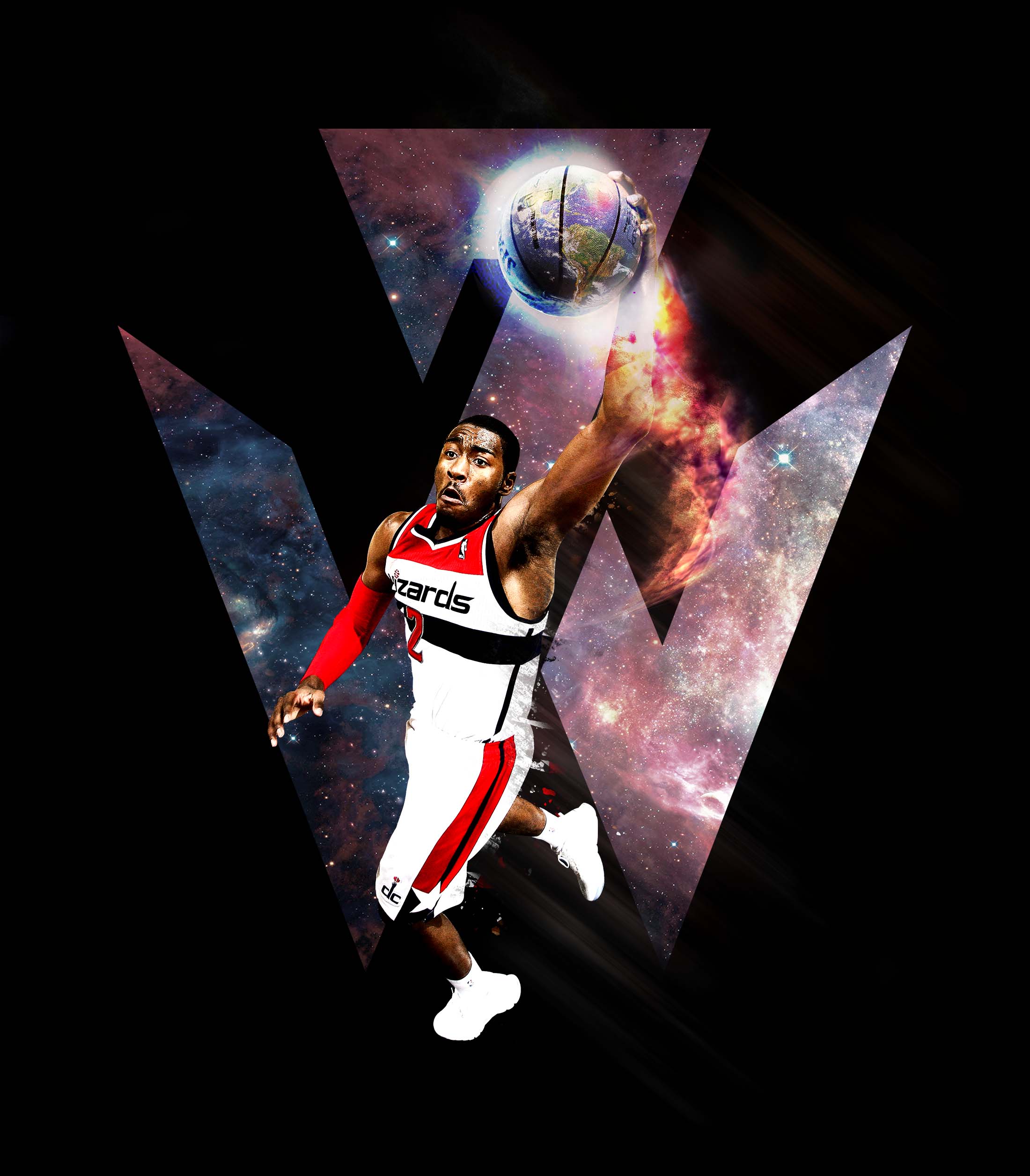
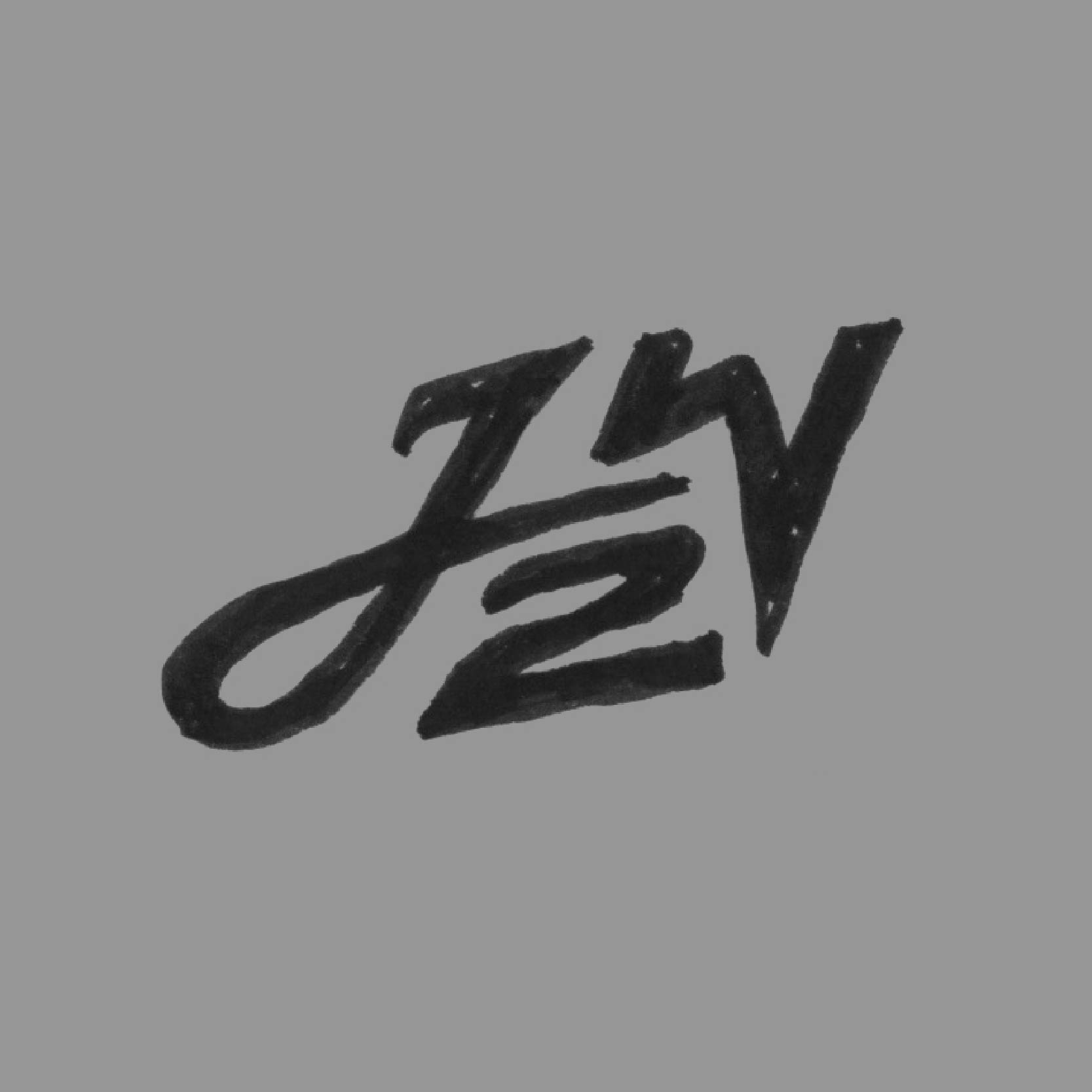
Together, the two separate parts of the logo are made up of a J and a W.

footwear & apparel

Shoe Release - 06

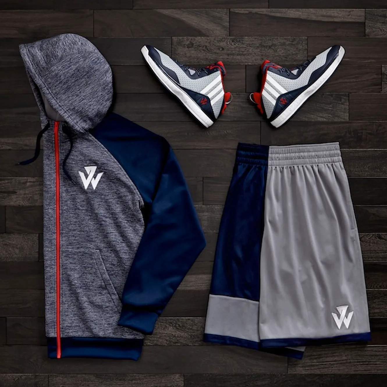
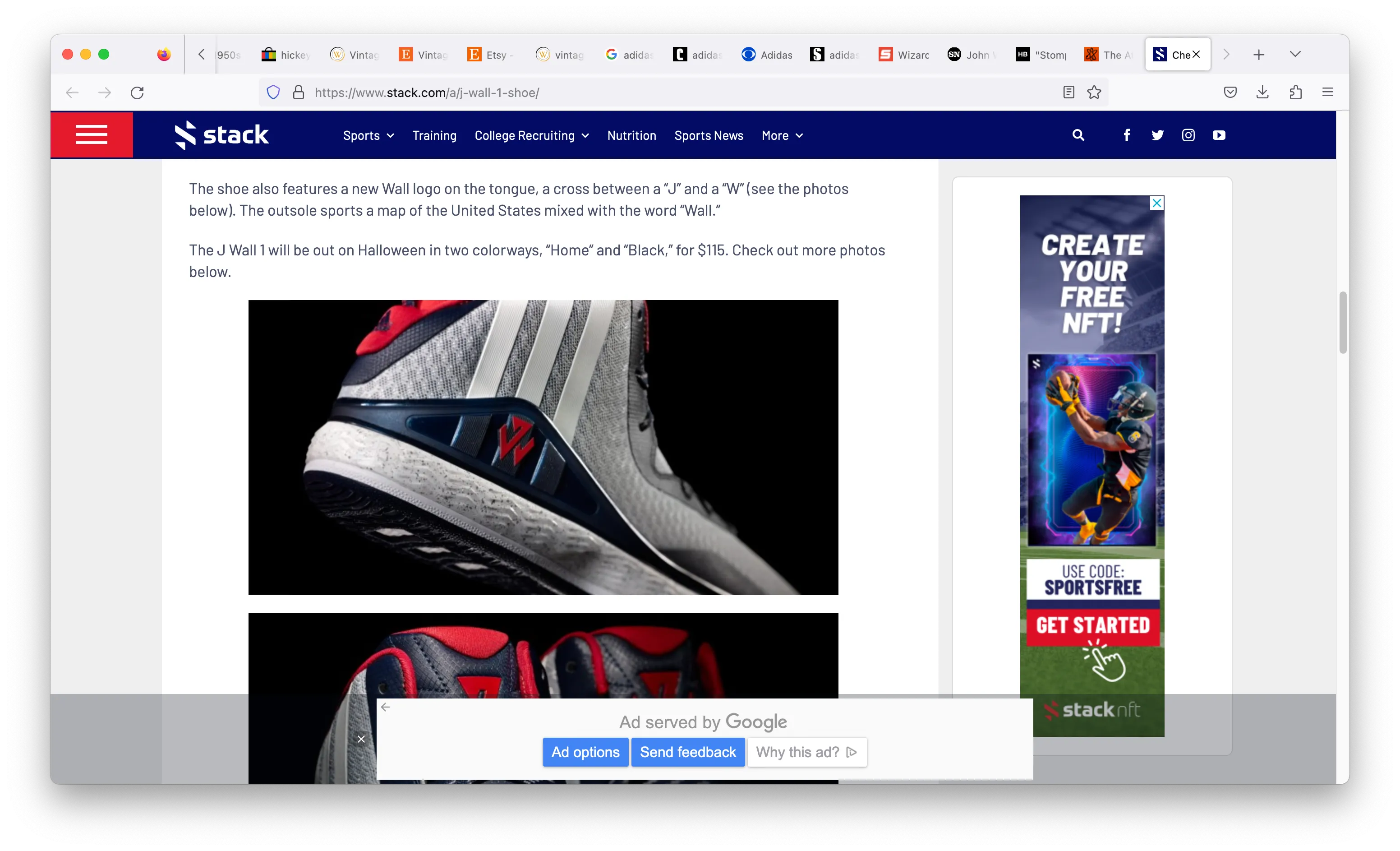
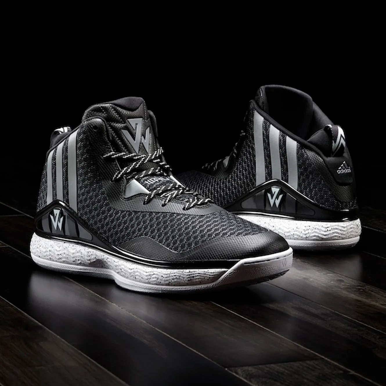
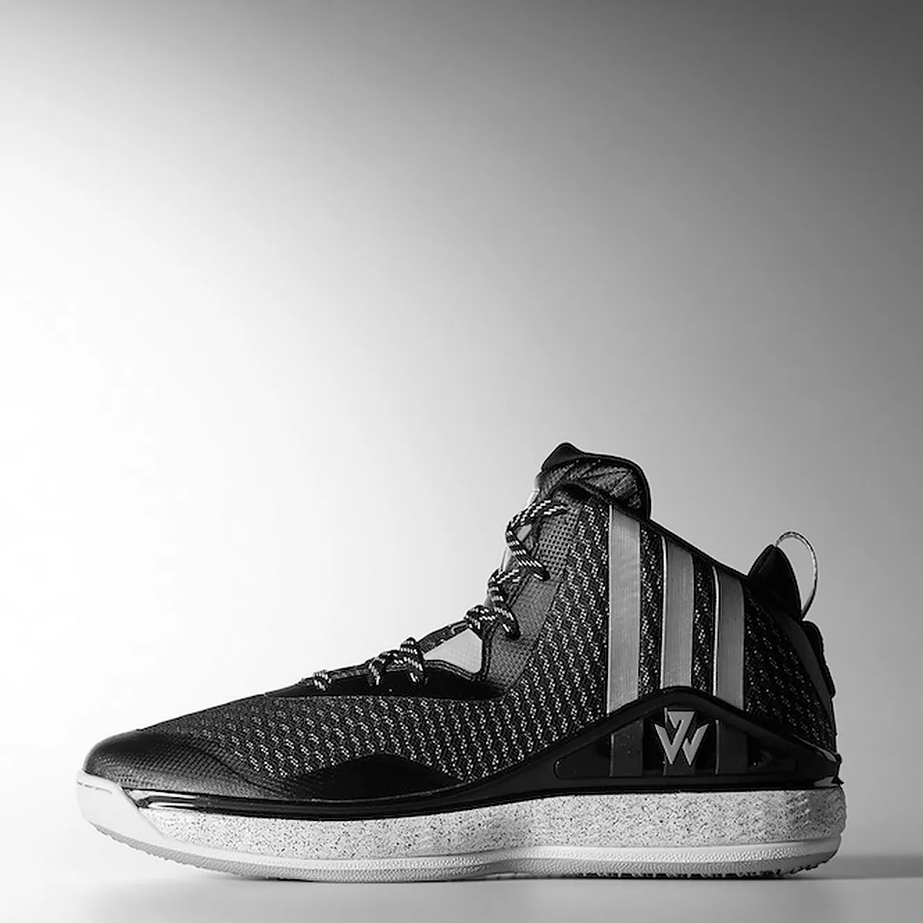
The mark debuted on John's first pro model with Adidas, the J Wall 1, adorned big and bold on the shoe's upper tongue. The shoe was initially released in a black and white colorway as well as in the Washington Wizards team colors.

A harmonious relationship

Part of the challenge when creating any new logo under the adidas umbrella is ensuring that new mark feels familial. For this, we made sure John's mark felt like an adidas through carefully considered geometry. With this, we brought harmony to the pair when shown together (which happens a lot on product), as well as visually signaled his shift to the Adidas team.

It's Alive!

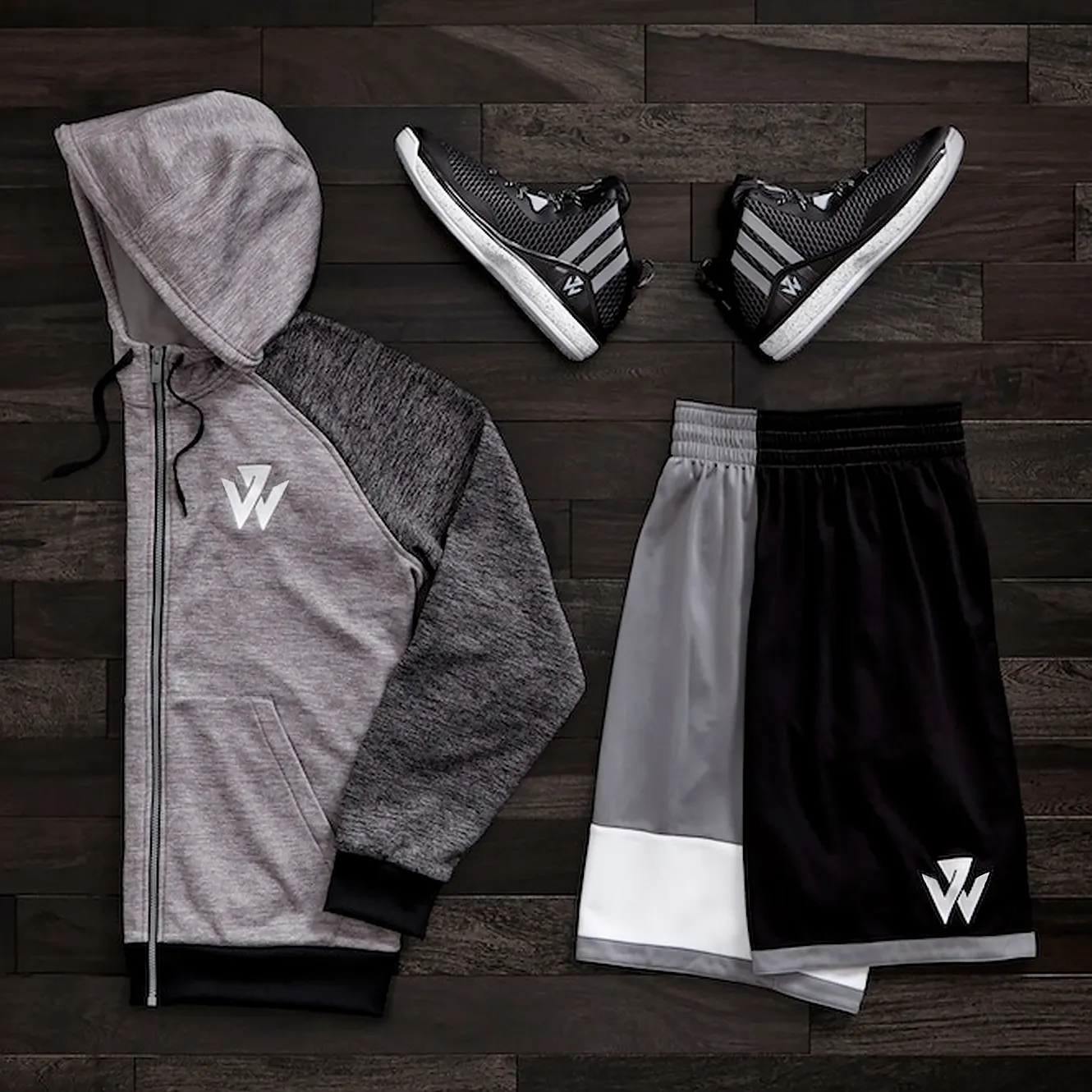
Once the logo was finalized and handed off to product teams, an array of fun apparel and footwear launches followed. John celebrated the launch traveling to China, where he debuted his freshly branded line of wears.